Last Updated on June 15, 2023
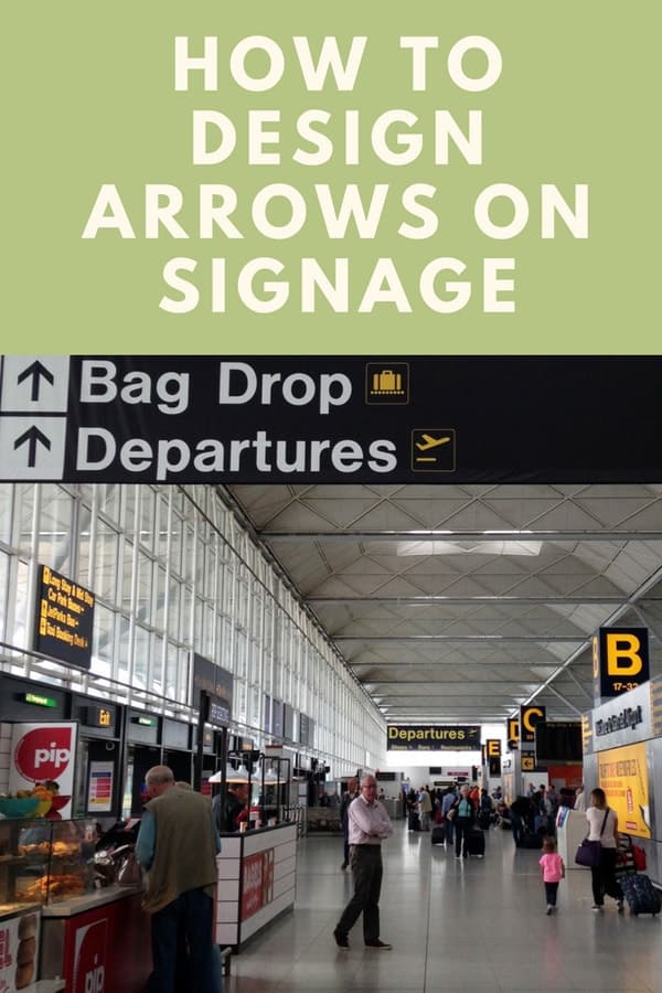
In this lesson on wayfinding, we will look at arrows on signage for when you are designing with navigation and wayfinding in mind!
Table of Contents
Introduction
Hi, I’m Dr Paul Symonds and I’m the Wayfinding Expert. Please make sure to subscribe to my Wayfinding Channel on YouTube to get the very latest videos on all aspects of wayfinding and navigation.
You might look at signage and not spare too much thought for the direction, shape and size of the arrows normally, but if you are involved in any way at all with making or needing signage to guide people, there is a lot to think about! And arrows ultimately are what direct people on signs and so the design of the arrows is vital.
Take a look at this image below!
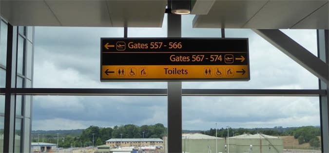
When designing signage to guide people from A to B, the key is to try and make the signs as easy as possible to read, with:
- Simple and clear text
- Arrows that easily guide people
- The right text in terms of terminology
- Good text versus background colours
- And also the right background lighting for the signs.
How to write text on signage, signage lighting, and colors are topics that are coming up in the next lessons but in this lesson, let us turn out attention to arrows in signage!
What?! A whole lesson on Arrows in signs? Are you crazy?!
The first reaction, when thinking about arrows on signage and for signage design is, what!! A whole lesson on designing arrows! Really! Are you insane?

I even wondered if there was enough to talk about arrows but, as I have researched the subject further for this video, I realized that there are several points that are important and which do indeed greatly impact the User Experience (UX).
Key Point 1 – Do not point arrows into text!
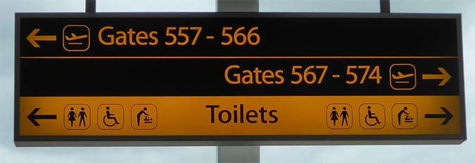
Arrows should always point towards the location being directed to, not into text!
In the image above, there is a great example of arrows being used correctly. Gates 557 – 566 are to the left and so the arrow is on the left and pointing towards the space where the gates are.
Gates 567 – 574 are to the right. Some designers will argue that arrows can point into text, but the point is that you are using the arrows in signage to point to a location, not to point to text.

In this sign, I am sure you can see the problem and the confusion that having arrows pointing into text can cause!
Having arrows pointing into text can create all kinds of problems and in this example above, you can see that two arrows point into the word and place name, Catania.
There is also an arrow pointing to the right and placed beside the word Catania, to signify to go right for Catania! Confused? I am not surprised.
If you are a designer, never point arrows into text!
Key Point 2 – Separate arrows on signs if it saves confusion
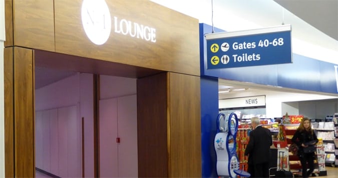
In this image at an airport above, a lot of people wrongly turn into the toilets hallway for gates 40 – 68.
The solution that I suggested to them is actually quite simple. By placing the arrow on the right of the Gates 40 – 68, the arrow is more closely pointing into the very space where they need to go.
Changing the position of the arrow in the signage can make a huge difference.
It is often quite a subtle difference in signage that can have quite an impact.
Sometimes it is very subtle changes that make a huge difference in signage design in terms of wayfinding.
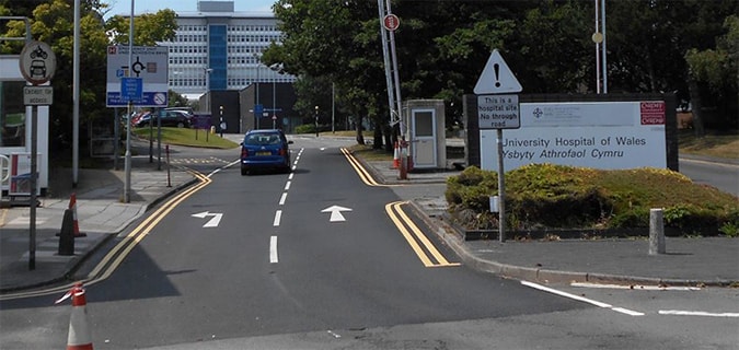
Remember also that, for a lot of signs, a person may be driving and this is why getting every detail of a sign can be so important, given that the user often has so little time, relatively speaking, to see and digest the sign.
I talk more about this in the video on wayfinding in hospitals i.e. whereby you can sometimes use speed limits to slow down drivers so that they have more time to read signage.
Key Point 3 – Size and Visibility
Here’s an example of how not to do it.
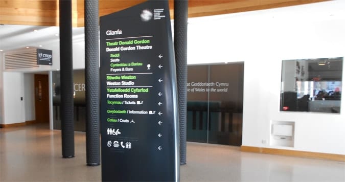
There are a few problems with this signage above!
- The arrows are way too small and hence lack any clarity from any kind of distance.
- The arrows, once again, we see are pointing into text and this is something you should always avoid when designing directional signage. It is proven that this makes it harder for users to sub-consciously use the sign intuitively, because users look at the arrow and the text and then consider what direction to go, as opposed to seeing the direction and then the location.
The arrows on signage should be clear and easy to see.
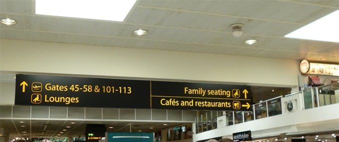
Take a look at the image above and compare it with the previous sign! A huge difference in clarity and readability I am sure you will agree!
Key Point 4 – Good Background Contrast for the Arrows on Signage
There should be a good contrast between the arrows & the background.
The sign you are looking at is also very good in that the contrast between the yellow arrow and the black background makes seeing the arrows very clear.
Always aim for the right contrast in terms of color.
More on color in the video that is coming shortly on using color in wayfinding (make sure to subscribe to catch that video).
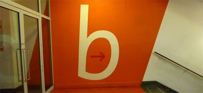
Art galleries and museums I find quite often are the worst at designing signage, perhaps because of their desire to be creative override the need, in wayfinding, for designs that push simplicity and conformity.
In this sign, the red arrow is barely visible if you glance quickly at the signage.
A red arrow on an orange background? What is going on here?
It might not seem like the end of the world but, if you are approaching this sign, then you actually think you are on floor B but in fact, it is the floor below hence the red arrow, an arrow you can easily miss as you approach the sign.
Key Point 5 – Keep the design of arrows simple!
Give your arrows tails!
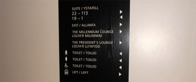
I have to be quite honest and admit that, until recently, I had not seen arrows on signage without tails.
The thing about the wayfinding and signage design industry is that there’s always something new to see and, in this photo [point top right], it is really much harder than it should be to read the directions quickly. Make sure you include tails on the arrows!
In wayfinding it is important to understand that creating new exciting designs is not the key.
The key is designing signage (and including arrows) so that they can be understood by as many people as possible and without too much effort needed.
Key Point 6 – Consider grouping information
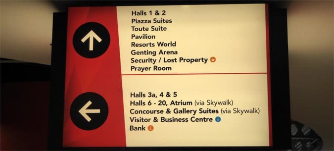
I will talk in the future (see the YouTube channel) about hierarchies of information on signs and considerations such as nomenclature, so do not worry too much about the text in this sign for now.
But suffice to say that I am sure you agree that the arrows are clear and the directions clear in this image that comes from a local exhibition center.
Grouping information can potentially be a good way to make signage cleaner.
Grouping information can be a good solution when you would otherwise need to use so many arrows on the sign.
Try and simplify things for the user.
As you can see, the extra space from only having two arrows means that the arrows can be large and are very easy to follow. Try to group arrows facing in the same direction!
Key Point 7 – Understanding upward and downward arrows
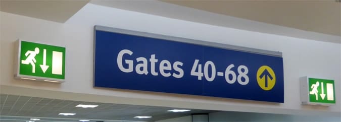
And now we have a conflict of up and down arrows, even though both signify to go straight ahead.
In the image above you can see that the green emergency signs have downward arrows, whilst the blue sign uses upward arrows.
There is no decline though immediately ahead of the sign so the arrows are wrong.
The rules are very simple for whether or not to use upward or downward arrows!
Use a downward arrow if there is some downward movement needed just ahead. Otherwise an up arrow.
Key Point 8. Use the correct sequence of arrow, icon and text
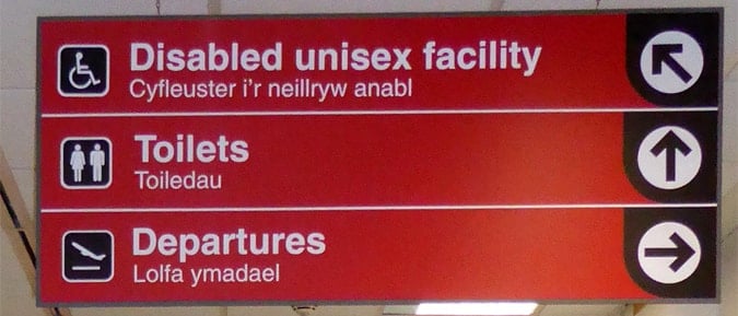
In this sign above, you can see that it is a bit awkward having an arrow pointing from the upper right to a location that is actually towards the upper left.
It makes little sense and is awkward to design signage in this way. Quite clearly, the arrow pointing left should be on the left.
The sequence is actually very simple for using arrows on signage.
If you are pointing to the left then the sequence from the left is an arrow, icon and then text.
If you are pointing to the right then, from right of the sign moving inwards, you use arrow, icon and then text.

Take a look at this sign above to see how it should be done correctly. The text is always the most central item, followed by an icon and then the arrow.
Key Point 9. Do not try to be too clever with the arrows design
You have already seen in point 4 above the orange sign with a red arrow on it and how it creates a lack of clarity.
In the picture below you see a sign in Olden, Norway (I was there on a cruise and it’s a beautiful area by the way) and I had to look at it twice to understand what direction it was pointing me in.
Signs should never need a double look as arrows should be immediately clear.
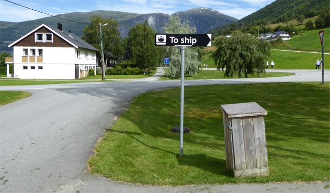
Here’s another example.
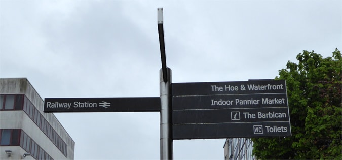
Make sure you actually include arrows on wayfinding signs. They are the very item that guide people.
In this image above in Plymouth, England, you can see what is known in the signage industry as a fingerpost sign.
The signage looks like several fingers pointing out from the pole, hence its name.
Always make sure to include arrows rather than to assume that the direction of the finger will direct people in the sign. Why not create absolute clarity.
The way I see great signage design for wayfinding, is as a percentage game. Every little thing you can do to make signage as clear and easy to understand, make that sign that little percentage better.
In wayfinding, it is the lack of attention to detail that leads to signs being confusing for people and why people end up getting lost so easily.
Provide supporting text for arrows.
In most places, it is a great idea to ensure that you actually include text with an arrow, so that users know where they are actually trying to get to.
This might seem obvious but, as you can see below from this museum example, where exactly we are being directed to is not clear.
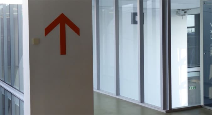
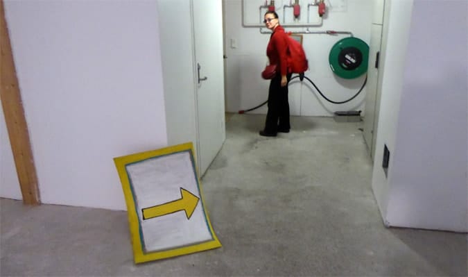
I have to admit though that I have seen great use of arrows with no text when I was in Norway.
One shop owner of an art gallery placed a series of arrows in her underground shop and the intrigue of where the arrows led to, got the better of many of us and we ended up in the shop.
In this case, it was a very clever use of missing information in order to create intrigue.
Generally speaking though, made signs clear and include text with the arrows!
Conclusions
So let me clarify the main points from this video.
Some designs are such that it really takes an effort to find the information you need so that you become conscious of the fact that it is hard work trying to find your way.
Good signage should make it really easy for the person or people you are trying to direct.
Arrows in signage should:
- Point in the direction of the location and not into text
- From the middle of the sign: text, icon and then arrow
- Arrow pointing downwards for straight ahead only if there is a downward gradient ahead
- Have arrows that contrast with the background of the sign
- Be thick and large enough and come with a tail.

Dr Paul Symonds has a PhD in Wayfinding from Cardiff Metropolitan University in the UK. Paul works with the signage industry, airports and other locations providing wayfinding audits, consultancy and training.




I have to disagree with the arrows into the text point. The example of the street sign shown would be much more difficult to read while driving than a similar design where the arrows are occupying one column and the text is on the other, allowing the eye to quickly find their destination and then jump over to its arrow.
Any directory, wayfinding, or directional sign would be horrible to read if the name of each location were bounced all around the place to accommodate their respective directions.
Do a quick Google Image search of ‘Wayfinding Signage’ and you’ll see exactly what I’m referring to.
The example with the airport overhead sign works because there are only a couple of items and the sign has a very wide ratio leaving enough negative space to allow the eye to move around fluidly enough.
Above is the example you sent me by email Nate.
Yes, first sign is fine but for the other 4 examples. Tes, very badly designed signage so good to see them as it helps to show why people so easily get lost when trying to read signage from cars.
You do not want signage that, for example, has an arrow pointing up to an arrow that then points to the right. No wonder users sub-consciously then get lost 🙂
Likewise, when the user sees his/her location you want text pointing to the space of the location not into text. Subtle thing but can slow the person down thining-wise.
With wayfinding signage, especially for people driving, we want signage to be as quick to understand as possible.
Why also have signage with 3 small arrows pointing into the same direction rather than one larger arrow for all 3? All design basics.
cheers, Paul
Great article! Do you have a preferred arrow style? I’m designing wall mounted blade signs to contain text and arrows for 7 locations, hanging @ 8-10′ with a view distance of up to 50′. Lettering is 4″. I’m currently using an “airport style” 90 deg filled arrow with a tail
Excellent article! Is there a recommended chronology of arrows? I’ve been taught that we should always use the “SLR” or Straight, Left, Right methodology to list directions on a pedestrian or vehicular directional sign, and a colleague is arguing that vehicular directional signs should be Left, Right, Straight. Curious to learn your thoughts.