Last Updated on June 12, 2023
In this post, we look at Hospital Wayfinding and implementing a strategy to make it as easy as possible for visitors to find around these complex buildings.
There are many ways in which you can guarantee a more efficient and better-planned hospital and medical centre wayfinding strategy and below I will tell you about some of the best ways.
Table of Contents
Consistency of Signage
One of the very first things you need to consider is the idea of consistency.
This is often different for larger hospitals because they tend to use such a variety of service providers for the different services on their grounds.
The car parking, for example, might be managed by one service provider, whilst the general signage for different departments might have been designed by different providers (even though it should not have been.
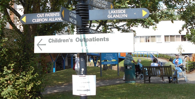
There really needs to be consistency throughout the hospital and with each type of sign colour coded and kept to its own signage type.
Emergency signs, for example, should be one colour, directional information another and parking signs another.
Consistency needs to also be built into the entrances to the grounds so that there is some form of consistency between the signage one sees outside of a hospital, to the hospital grounds itself.
You can actually use differentiation to make it clear to drivers, for example, that they have entered the hospital grounds.
Use signage that is clearly different from road signage outside of the grounds.
You can then re-enforce the fact that the driver has now entered the hospital grounds, to also guide them to slow down as they enter. Use this for speed limits and controls.
The problem, for those driving into the grounds, is that a very high percentage of users will be unfamiliar with the area.
Thus, creating a situation in which decision-making time is increased by driving at a steady speed is helpful.
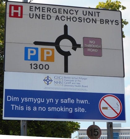
Clustering and Signs Clutter
The sign above is a good example of clustering, with ‘No Smoking’ information included on a sign, which is aimed at drivers who already have their minds occupied with trying to find the parking area or some other drop-off area.
Drivers can only be distracted by this surplus information.
Much more important at this point is the ’15mph’ sign, which you might have actually missed on the sign above, given the size of that sign and the fact that it has not been cleaned in a long while.
This is just one example of hundreds of signs in the hospital in question and this does not take into consideration the use of space and design in the wayfinding.
Visit many hospitals and you will a lot of information on walls, which is not necessary and competes for space with much more important signage and information.
The clustering of information and signage can be a particular problem in a hospital environment and often needs tackling.
One solution towards solving the clustering problem is to create areas and to isolate different signage types.
Having all informational and medical-based information in one area or noticeboard area for example.
One area for directional signage information and so on.
Separating different types of signage can be just one way to begin to make navigation easier for the users. There tends to be the need also to include advertising information in some hospitals.
This can also be isolated so that it is clearer for the users of the hospital. This issue of advertising and money brings me to the next subject of steering behaviour.

Steering Behaviour
Hospitals clearly have a defined goal, which is to first and foremost treat people for medical problems.
Many hospitals, nevertheless, also these days are focusing more and more effort on trying to use commercial opportunities, where viable, to bring in much-needed extra income and this is where steering behaviour comes in.
Guiding users towards locations where they might spend money, such as in the shops, coffee shop, restaurants, parking and so on, is more than just about signage.
It is about the way in which space is used to move people, the signs, the positioning of such services.
I will not go into any depth in talking about steering behaviour here, but at least I have mentioned and highlighted how this is a consideration and an important part of wayfinding in a hospital.
Saving Employee Time – Real Costs
Time and money become very important in the wayfinding process in that any implementation needs to be cost and time effective.
Studies have shown that the time spent answering route and directional questions from hospital users, can cost employees such as nurses, up to 15% of their work time.
A poor hospital wayfinding system, in other words, might not only cause unnecessary stress for users (many of whom are already distressed connected to their need to visit the hospital) but can also come at a time cost to employees.
There is though also a third cost and that is in relation to steering behaviour (a subject discussed above).
Make navigating easy and relaxing and the users are more likely to spend money in the retail outlets in the hospital.
Through the use of good signage, use of space and architecture and by ensuring the correct mix of outlets, you can also use wayfinding to improve the commercial viability of a hospital.
Terminology and Nomenclature
One of the biggest problems which exist in many hospitals is the disconnect between the terminology often used by staff and the terminology used by visitors.
This is one of the most common issues in the breakdown of navigation around hospitals and yet potentially one of the easiest to fix.
A lot of medical staff and employees use medical terms, that general users of the hospital may simply not be familiar with.
Further problems can exist in many hospitals because of the strange trend towards terms for supposed marketing purposes, rather than for practical use.
A classic example I came across recently was the use of the term ‘Help Desk’ as the name for the main reception area. Tell people to head to the help desk and they might have no clue where it is.
Yet, call it by what it really is and the user might already have passed it and know where it is.
Naming conventions for users, rather than for the sake of the marketing team or for employees, can often make a lot of sense in a location where large numbers of people need to navigate.
Website Provision and Mapping
Why not make it easier for those using your hospital and utilise technology and very inexpensive methods? It sounds too obvious perhaps?
A hospital I used a few years ago in Barcelona, Spain, after getting injured playing football, was the best hospital I have ever found in terms of wayfinding.
On entering the hospital and reaching reception, I was handed an A4 printed map with a red line on the map, showing me the exact direction I needed to take.
So simple. It is very easy for any hospital to create similar maps and make them printable on their website, yet none I know of do.
Use your website and offer downloadable maps to the different wards, areas of the hospital and to the different facilities.
It is very cheap and easy to do and can make a significant difference for users. The same maps can be used on mobile phones to navigate indoors.
Integrated Service
To really understand how wayfinding works at its best, it is important to understand the idea of having an integrated system.
If the user cannot find the hospital because of confusing signage which makes finding the hospital very difficult to start with, for example, user satisfaction is already low.
The use of a hospital, of course, is to treat people and not to offer the very best possible user experience, such as an airport has more reason to do, but a certain level of satisfaction should still be provided.
Areas such as the entrance to the grounds, the connection between car parking, reception, facilities and wards should all provide a free-flowing process.
One way to help this integration is with the use of colour coding.
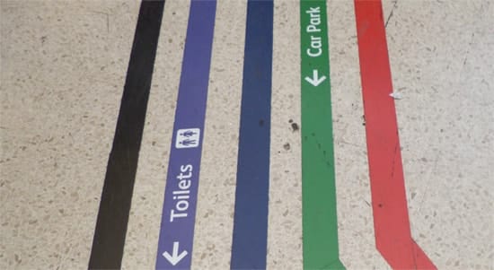
Colour coding is not suitable for every medical location, but can sometimes be a useful option.
Colour coding with marked lines on the floor or buildings and wards which are colour coded are two such options. It can though be very useful as a way of differentiating buildings.
Signs Maintenance and Hospital Wayfinding
It is essential that all signage is monitored for condition and cleanliness (it is amazing how many signs cannot be seen because they are not cleaned).
The date of the last checks, the location, the signage type etc should all be documented and checked regularly. A database is perfect for managing this process. More on signs maintenance here.
Users Feedback
One of the most valuable ways to begin to understand any problems that exist in your wayfinding system is to ask the users – and that includes the staff.
Qualitative interviews are the best option so that you have the chance to really understand the problems users face in navigating your facility.
Staff can be a great resource because they get to experience the problems that people have on a daily basis.
You might find that there are certain places which visitors constantly have a problem finding.
When talking to hospital visitors, make sure also to talk to familiar and unfamiliar visitors, so that you can get a true understanding of the issues for all users.
Make sure also to interview users of different abilities such as wheelchair users, the elderly and those navigating with children in tow.
Further Help
If you need further help do not forget that we offer hospital wayfinding audits!
Dr Paul Symonds has a PhD in Wayfinding from Cardiff Metropolitan University in the UK. Paul works with the signage industry, airports and other locations providing wayfinding audits, consultancy and training.

