Last Updated on June 12, 2023
In this post, a look at wayfinding signage design basics
Table of Contents
Signage Space and Positioning
If you read through the majority of journal articles on wayfinding, you will find that the concept of ‘travel spaces’ and what is often termed ‘performance space’ (see Edensor, 1998) are very popular concepts and used in relation to wayfinding.
The idea behind the term ‘performance space’ is that a travel space such as an airport is seen almost like a stage, with the people who use the travel stage considered ‘actors’.
The benefit of seeing what goes on in a travel space as a performance is that we then begin better to understand the dynamics which occur in these locations and this changes the way we think about wayfinding and how to improve the experience for travellers.
The chances for example of walking through an empty airport (unless for the early hours when no flights leave) and having the place to yourself is unusual.
We have to navigate around and alongside others.
Wayfinding, in other words, tends to be not just a directional experience but one which is socio-cultural in nature, almost like a play involving many characters and with people backstage (such as the management and service providers) and those front stage (the travelers).
When we delve further, we become aware of a point made by Gibson (2009) when he explains that if a building is badly designed, then no matter what signage you implement in the building, wayfinding will always be hugely problematic.
The use of space alone can also greatly impact one’s navigation through space.
You might have noticed in fact how some travel hubs use space such as narrow hallways when you are being guided through one area and then larger spaces when you have reached a different place.
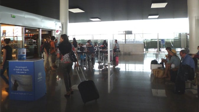
A good example is when you are in the security area of an airport which has low ceilings and narrow pathways and then after security, you then walk out into the wide open and normally well-lit area of an airport departures area.
The large space incentives you to explore and walk around (and spend money in the shops and restaurants) now that security is complete.
Space is subtly used and can be highly influential. With a building or external space such as a tourist attraction, if the overall design of the architecture or space is very poor, no matter what signage is implemented, there is always likely to be confusion for the person navigating.
Signage though is important in the right context.
Travel and Wayfinding Signage Design
With good building design use of space, whether an inside or outdoors area, signage becomes important.
There are dangers though in over signage and even when signage is well placed and not clustered, the signs might not be readable or be readable but not actually understood.
The language or symbols can sometimes be read but they lack meaning or create more confusion than they help.
Creating effective signage is far from simple. In the travel industry in destinations, airports, attractions, and other travel spaces, there is a need to try and accommodate people of all age ranges, nationalities (from around the world who use a wide variety of languages), and people of various abilities in terms of sight and other disabilities.
Consider for example that 10 – 15% of travelers are said to have sight problems and consider the travelers who are in wheelchairs and are viewing signs from a lower height.
These travelers may be the minority but they have as much right to be provided for as any of us.
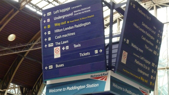
Signage thus needs to be readable from a distance, from different heights and the background colors need to provide clarity rather than being difficult to view.
For indoor environments, lighting can also be very important, with the sign which sits in a dark corner often pointless.
Signage and Signs Placement
Careful consideration has to be given to the placement of signs and in doing so, awareness of the different types of signage needs to be understood. It is no good for example to place signs just after key decision points.
The signs should be just before or at the decision points and the signs need to be clear and unambiguous.
One of the big problems with the placement can be a political one in those other stakeholders in a travel space may also be vying for signage space.
Signs which highlight sometimes mundane and unnecessary information have to remain because of the needs of others in an organization and this makes the challenges faced by wayfinding experts even harder.
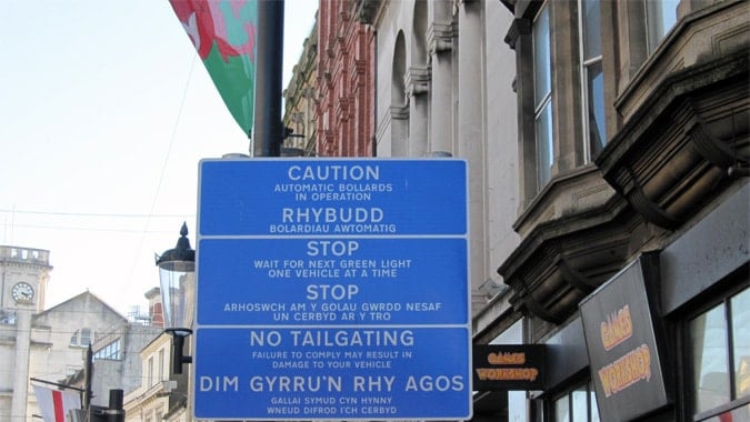
The political problems can sometimes come in the form of regional politics such as the need for signs to be in Spanish and Catalan or Welsh and English.
The insistence of some decision-makers to create signs which are designed for the requirements of politicians themselves rather than for the end user, often results in signs which become so full of text that they cannot be read when driving by anyone in any language, in practical terms.
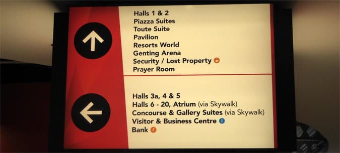
The sign below is challenging for any driver to read and much of the text is quite impossible to read from the opposite side of the road from which the oncoming traffic is approaching.
It is essential that signs are designed for the users rather than for political reasons if a successful and efficient wayfinding system it to be created.
Wayfinding designers, in other words, have a difficult job because of stakeholder needs.
Not all stakeholders will be concerned with the wayfinding and have very different priorities.
Signage Maintenance
Even when signage is positioned well, readable and understandable, the signs need to be well-maintained and checked regularly.
This can become a challenge in an urban area in which there are hundreds of signs, or in a large airport with multiple terminals and connection areas between terminals.
One of the best ways to manage the maintenance of large numbers of signs is to create a database and to code each sign according to its location and sign type.
Create a detailed list of all signs to be checked and check them monthly.
Digital Signage
One assumes that digital signage is the future and digital and electronic forms certainly offer many advantages. They also though create problems.
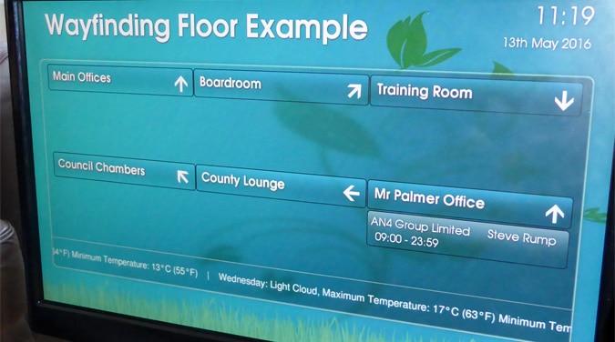
Electronic signage affords us the opportunity to create changeable signs which can be updated instantly, much like we often see our departure boards, informing us which gate to head for.
Consider though my experience last xmas whereby there is a complete crash in the computerized systems in an airport and chaos takes hold.
Over-reliance on a computerized system can be problematic and there is certainly a place in the travel industry for non-digital signage.
A combination of digital and non-digital is recommended.
Other Wayfinding Signage Design Considerations
You may have read our recent post on color coding and wayfinding and this is certainly one good example of how problems in creating over-signage can be avoided.
In locations where there are already too many signs, color coding different buildings or parts of a large building can be a very effective technique. Colour coding with colored lines on the floor is another option although this can be problematic in that the lines can be hard to remove or replace and these lines can ultimately create more confusion than they help.
Signs can also become landmarks in their own right as discussed by Lynch (1960).
People can, for example, agree to meet at a specific sign and the sign thus becomes important not because of what the intended message is on the sign, but because the sign can be seen from a distance and acts as a perfect meeting point.
References
- Provision of directional signage you can contact clipdisplay.com.
- Edensor, T., 1998. Tourists at the Taj: performance and meaning at a symbolic site. Routledge, London [u.a.]
- Gibson, D., 2009. The wayfinding handbook: information design for public places. Princeton Architectural Press, New York.
- Lynch, K., 1960. The image of the city. MIT Press, Cambridge, Mass.
- Miller, C & Lewis, D. (1998). Wayfinding in complex healthcare environments Information Design Journal, 9 (2-3), pp 129-160.

Dr Paul Symonds has a PhD in Wayfinding from Cardiff Metropolitan University in the UK. Paul works with the signage industry, airports and other locations providing wayfinding audits, consultancy and training.

